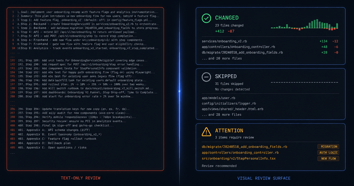
The Wall of Text Your Team Stopped Reading
A 400-line AI-generated plan lands in a pull request. Three reviewers approve it within minutes. Nobody catches the misconfigured database migration buried on line 247. The plan was correct. The review was not. The format made it almost impossible to spot the problem without reading every line, and nobody did.
This is not a discipline failure. It is a format failure.
AI solved the generation problem. A reasoning model can produce a detailed implementation plan, a full architecture document, or a 200-line changelog in under a minute. According to a16z's 2025 analysis of over 100 trillion tokens processed through OpenRouter, programming tasks rose from 11% of token volume to over 50% by year end. Reasoning models consume 10 to 40 times more tokens per query through chain-of-thought. The volume of text humans are expected to review has grown by an order of magnitude in two years.
The comprehension problem is wide open. We optimized for output volume and forgot about review surface area: the amount of information a human can comprehend per unit of time. The bottleneck is no longer generation. It is comprehension.
Three Reasons Text-Heavy Review Breaks Down
Text-heavy review fails not because reviewers are careless, but because linear text is the wrong interface for the job they are actually doing.
1. Cognitive overload hits faster than you think
Nelson Cowan's landmark 2001 research in Behavioral and Brain Sciences established that human working memory holds approximately four chunks of information at once, not the seven that Miller's earlier work suggested. A 300-line implementation plan exceeds that capacity by an order of magnitude. By the time the reviewer reaches line 150, the context from line 20 has been displaced. They are not reviewing. They are re-reading.
2. Humans scan, they do not read
Jakob Nielsen's research at Nielsen Norman Group (2008) found that users read at most 28% of the words on an average page. The more realistic number is closer to 20%. Readers follow an F-shaped scanning pattern: they read the first two lines, scan the left edge of subsequent paragraphs, and skip everything else. In a 400-line plan, the bottom half is functionally invisible.
3. Text is the wrong interface for comparison
Diff views work for code changes because code has clear boundaries: functions, classes, return values. They fail for architectural decisions, dependency relationships, and sequence logic. When two competing agent plans both describe a migration strategy in prose, the reviewer cannot compare them without holding both in memory simultaneously. That is a task working memory was never designed to perform.
How Humans Actually Process Information Under Time Pressure
The human visual system processes images in as little as 13 milliseconds, according to MIT research published in Attention, Perception, and Psychophysics (Potter et al., 2014). That is roughly eight times faster than the previously assumed 100-millisecond threshold. Visual processing is not just incrementally faster than reading. It is a fundamentally different cognitive channel: spatial, parallel, and preattentive.
The gap between what AI can produce and what humans can meaningfully review is widening. A 2026 working paper (arxiv 2603.26707) tracked AI context windows growing from 512 tokens in 2017 to 2,000,000 tokens in 2026, a roughly 3,900-fold increase with a doubling time of about 14 months. Human reading comprehension has not kept pace. The paper's estimate of Effective Context Span, a token-equivalent measure of sustained reading comprehension, has been flat or declining over the same period.
The implication is straightforward. If the review interface is text, you are routing information through the slowest available human channel. If it is visual, you engage spatial reasoning, pattern matching, and preattentive processing, all of which operate below conscious attention. A reviewer scanning a diagram spots the missing connection in seconds. The same reviewer reading a 40-line text plan might never find it.
The Agent Skill Ecosystem for Visual Review
A growing category of AI agent skills exists specifically to transform text-heavy output into reviewable visual artifacts. These skills do not make the model think better. They make the output easier for humans to verify. That distinction matters: internal reasoning quality and external reviewability are separate problems, and most tooling investment has gone into the first.
The skills fall into three categories.
Planning artifacts: before execution
/visual-plan takes a task description and produces a shareable visual plan with diagrams, file maps, annotated code blocks, and optional UI sketches. Instead of a 40-line text plan that reviewers scan and approve without reading, it produces a structured artifact where each step is visually distinct and dependencies are rendered as connections, not sentences.
/plan-arbiter compares competing agent plans and produces a decision memo. When three agents propose different migration strategies, the arbiter renders the differences as a structured comparison: rows are decision points, columns are agents, and conflicts are highlighted. The reviewer sorts instead of re-reads.
/read-the-damn-docs forces a documentation-first pass before implementation begins. It is an auditability skill: it surfaces what the agent should have known before it started coding, reducing the chance that the plan contradicts existing architecture decisions or API contracts.
Review artifacts: after execution
/visual-recap converts a branch, commit, or PR diff into an interactive visual summary with annotated diffs, diagrams, and schema or API change summaries. Instead of scrolling through a raw diff, the reviewer sees what changed, what was skipped, and what needs attention, each in its own visual block.
/agent-watchdog audits another agent's work from transcripts, PRs, branches, or run summaries. It cross-checks what actually happened versus what was requested. The output is a structured audit trail, not a paragraph of observations.
/quick-recap adds a concise status block at the end of any agent task. The result is immediately readable as green, yellow, or red. No scrolling, no interpretation, no ambiguity about whether the task succeeded.
Representation transforms: any time
/visual-explainer produces self-contained HTML pages for diagrams, data tables, and visualizations. The output is a single file that opens in a browser and renders the content in a format optimized for inspection and sharing. It bridges the gap between a raw Markdown file and a presentation-quality review surface.
Mermaid-to-ASCII rendering (tools like mermaid-ascii) converts Mermaid flowcharts and sequence diagrams into terminal-friendly text. This matters when the review happens in a CLI, a CI log, or an SSH session where HTML rendering is unavailable. The diagram stays visible even in text-only environments.
/graphify converts entire repositories, documentation sets, or research papers into navigable knowledge graphs rendered as interactive HTML. Nodes represent concepts, edges represent relationships, and the reviewer can explore the structure spatially instead of linearly.
/project-artifact generates tabbed HTML status pages with inline SVG diagrams, status pills (done, in progress, blocked), expandable sections, and light/dark mode support. It is designed for projects too large for a single status update, where the reviewer needs to jump between workstreams without losing context.
/session-report produces an interactive HTML dashboard showing token usage, cache performance, per-skill cost breakdowns, and anomaly findings. Instead of reading a log file to understand where compute budget went, the reviewer sees sortable tables and drill-down views.
Before and After: What Visual Review Actually Looks Like
The argument for visual review surfaces is easier to understand when you see the difference. Four common review scenarios, shown first as text-only output and then as the visual alternative.
Agent plan review
Before: A 40-line text plan dumped into a PR comment.
## Implementation Plan
1. Add new column 'status' to users table with default 'active'2. Create migration file 20260628_add_user_status.sql3. Update UserRepository.findAll() to filter by status4. Update UserRepository.findById() to include status check5. Add status field to UserDTO6. Update API endpoint GET /users to accept status query param7. Update API endpoint GET /users/:id to return status8. Add validation for status enum values (active, suspended, deleted)9. Update unit tests for UserRepository10. Update integration tests for /users endpoints11. Add index on users.status column12. Update OpenAPI spec with new query parameter13. Run migration against staging database14. Verify staging deployment... (26 more lines)
The reviewer sees a numbered list. Steps 1 through 14 look reasonable. Steps 15 through 40 are below the fold. The dependency between step 11 (index) and step 13 (migration) is buried in ordering, not made explicit. If step 3 introduces a breaking change to the API contract, that information is in prose, not in a visual signal.
After: A visual plan rendering the same steps with dependencies visible.
The reviewer sees the shape of the work in seconds. The migration path (left) is visually distinct from the code path (right). The staging verification step sits at the bottom, dependent on both. If a step is missing, the gap in the graph is immediately visible. No scrolling required.
Post-task audit
Before: A 200-line changelog dump after an agent completes a task.
Modified src/models/User.ts - added status fieldModified src/repositories/UserRepository.ts - updated findAll, findByIdModified src/dto/UserDTO.ts - added status mappingCreated src/migrations/20260628_add_user_status.sqlModified src/routes/users.ts - added query parameterModified src/routes/users.ts - updated response shapeModified tests/unit/UserRepository.test.ts - 4 new test casesModified tests/integration/users.test.ts - 6 new test casesModified openapi.yaml - added status parameterSkipped: src/middleware/auth.ts (no changes needed)Skipped: src/config/database.ts (no changes needed)Note: Did not add rollback migration (not requested)Note: Status enum uses string type, not integer... (187 more lines)After: A visual recap with three summary cards.
The reviewer's eye goes straight to the red "Needs Attention" card. Two items require a judgment call. Nine files changed as expected. Two were correctly skipped. The entire audit takes ten seconds instead of five minutes of scrolling.
Multi-agent plan comparison
Before: Three competing text plans from different agents. The reviewer must read all three, hold the differences in memory, and decide.
## Agent A: Migration Plan
I recommend a single-step migration. We add the status column with aDEFAULT 'active' constraint, backfill existing rows in a single UPDATEstatement post-deploy, and add the index after the backfill completes.Downtime estimate: 3-5 minutes during the ALTER TABLE lock. Rollback isstraightforward: drop the column. Total effort: ~2 days.
## Agent B: Migration Plan
I recommend a blue-green deployment strategy. We provision a seconddatabase with the new schema, run a continuous replication job from theprimary during the cutover window, then swap the connection string atthe load balancer. Zero downtime. The pre-deploy backfill runs againstthe replica before traffic switches. Rollback requires re-pointing theload balancer to the original database, which introduces moderatecomplexity if writes occurred on the new primary. Total effort: ~5 days.
## Agent C: Migration Plan
I recommend a rolling migration using expand-contract. Phase 1: add thecolumn as nullable with no default. Phase 2: backfill concurrentlyusing batched UPDATE queries (1000 rows per batch, 50ms sleep betweenbatches). Phase 3: add the NOT NULL constraint and default. Phase 4:drop the old code paths. Zero downtime, but rollback is complex becausethe concurrent backfill may leave partial state if interrupted mid-batch.Total effort: ~4 days.... (each plan continues for 300+ more words)
After: A comparison table where rows are decision points and columns are agents.
| Agent A | Agent B | Agent C | |
|---|---|---|---|
| Strategy | Single step | Blue-green | Rolling |
| Downtime | 3-5 min | Zero | Zero |
| Rollback | LOW | MED | HIGH |
| Backfill | Post-deploy | Pre-deploy | Concurrent |
| Risk | LOW | MED | HIGH |
| Effort | 2 days | 5 days | 4 days |
The reviewer compares six dimensions across three agents in a single glance. The color-coded risk pills stand out immediately. Agent A is the lowest risk and fastest. Agent C's rollback complexity is the outlier. The decision takes thirty seconds, not thirty minutes of cross-referencing prose.
Architecture documentation
Before: A 15-paragraph prose description of service topology.
The API gateway is the single entry point for all client requests.It routes traffic to the user service and the auth service based onthe request path. The user service handles all CRUD operations foruser accounts and stores data in a PostgreSQL cluster configuredwith one primary and two read replicas. When a user record iscreated or updated, the user service publishes an event to aRabbitMQ message queue. The notification service subscribes to thatqueue and sends emails, push notifications, or SMS messages dependingon the event type. The auth service handles token issuance andvalidation but does not communicate directly with the database orthe message queue. Rate limiting is handled at the gateway level.Health checks run on a 30-second interval across all services...
(continues for 12 more paragraphs)
After: A visual architecture diagram for browser review, with ASCII fallback for terminal environments.
The same information that took 15 paragraphs to describe is visible in a single diagram. The reviewer sees which services depend on which. The message queue sits between user and notification, not directly connected. The database serves only the user service. These relationships are spatial facts, not buried sentences.
A Workflow That Makes Review Visual by Default
Implementing visual review does not require rebuilding your documentation stack. It requires adding a presentation layer between the agent's output and the reviewer's eyes. The source stays the same: Markdown, MDX, or structured text files that are version-controlled, diffable, and agent-readable. The surface changes: rendered diagrams, summary cards, comparison tables, and status views that humans actually scan.
This is the "source versus surface" mental model. Markdown is the source format, designed for storage and portability. MDX and HTML are the surface formats, designed for human consumption. The source is for machines and version control. The surface is for reviewers.
A practical five-step workflow:
Step 1: Draft in structured MDX or HTML with semantic sections. The agent's output should have explicit boundaries: a summary block, a changes block, a risks block, a decisions block. Flat prose is the enemy. Structure is the prerequisite for visual rendering.
Step 2: Generate diagrams inline. Mermaid for sequences and workflows. ASCII for quick topology. Both are text-native, so they version-control cleanly and render in terminals, browsers, or CI logs depending on the environment.
Step 3: Surface summaries as visual cards. What changed. What was skipped. What exceptions arose. Each in its own visual block with a count and a one-line description. The reviewer sees the shape of the work before reading any detail.
Step 4: Promote exceptions to the top. Risk-based prioritization means the reviewer sees the items that need judgment first. This matches how the best AI and cloud operations teams work: automated checks handle the bulk, humans handle the edge cases, and the interface sorts by impact so nobody wastes attention on the routine.
Step 5: Preserve the full audit trail beneath the visual layer. The summary card links to the full diff. The diagram links to the source Mermaid file. The comparison table links to the raw agent plans. The visual surface does not replace the evidence. It layers on top of it.
One honest cost: visual surfaces add authoring overhead. Generating a Mermaid diagram takes longer than dumping text. Configuring a visual recap template takes longer than printing a changelog. The tradeoff is worth it only when the review actually matters: deploys, security changes, architectural decisions, migration plans. For a throwaway script or a local experiment, plain text is fine. The mistake is applying the same review interface to everything.
Visuals Improve Rigor. They Do Not Replace It.
The most common objection to visual review surfaces is that they hide detail. A summary card that says "9 files changed" does not tell you what changed in each file. A Mermaid diagram that shows the happy path does not show the error handling.
That objection is valid only if the visual surface is the final layer. It should not be. The visual is a triage layer, not a replacement for evidence. The full diff, the raw plan, and the complete audit trail remain available beneath the summary. The reviewer uses the visual surface to decide where to look, then drills into the source for the details that matter.
Think of it as a three-filter model. First, automated checks: linters, type checkers, security scanners, and policy validators catch the mechanical errors before a human ever sees the output. Second, the visual surface: summary cards, diagrams, and comparison tables let the reviewer sort and prioritize. Third, selective line-by-line review: applied only to the files and decisions that carry real blast radius, infrastructure, auth, migrations, and API contracts.
This is the same pattern that leading AI and cloud operations teams converge on: automated first-pass checks, explicit audit trails, risk-based prioritization, human review only where judgment is needed, and compact summary surfaces with deeper evidence available on demand. The visual layer is what makes that pattern usable instead of aspirational.
The Shift That Already Happened
The industry spent three years optimizing how much text AI can produce. Context windows grew 3,900-fold. Token throughput scaled. Reasoning depth improved. Almost none of that investment went into the other side of the equation: how much a human can comprehend in the time they have to make a decision.
The tools exist now. Visual plans, visual recaps, explainer pages, comparison tables, knowledge graphs, status dashboards, ASCII diagrams for terminals, and interactive HTML for browsers. They are not experimental. They are production-ready skills that transform the review experience from "read everything and hope you catch the problem" to "see the shape, find the exception, verify the evidence."
The next generation of AI tooling will not be measured by how much text it can generate. It will be measured by how little text a human needs to read before making a correct decision.
Sources
- a16z, "State of AI" (2025). Analysis of 100+ trillion tokens processed through OpenRouter, covering token volume trends and reasoning model usage patterns. a16z.com/state-of-ai
- Nelson Cowan, "The Magical Number 4 in Short-Term Memory: A Reconsideration of Mental Storage Capacity," Behavioral and Brain Sciences (2001). Cambridge University Press. cambridge.org
- Jakob Nielsen, "How Little Do Users Read?" Nielsen Norman Group (2008). nngroup.com
- Mary C. Potter et al., "Detecting Meaning in RSVP at 13 ms Per Picture," Attention, Perception, and Psychophysics (2014). MIT. news.mit.edu
- "The Cognitive Divergence," arxiv preprint 2603.26707 (2026). Analysis of the widening gap between AI context window growth (~3,906x since 2017) and human Effective Context Span. arxiv.org