Five numbers. 3x delivery velocity. 60% cloud cost reduction. A team scaled from one to fifteen. 75% of reporting automated.
I built the display for them using the pattern any AI tool would generate: a card grid, large metric values with gradient accents, labels beneath each one. The layout that looks polished in a Figma template and professional in a portfolio preview.
A design audit flagged the entire section as a P1 blocker. The finding: "Big number plus small label plus gradient accent equals SaaS landing page cliche. Undermines the technical authority positioning."
The numbers were exactly right. The frame was working against them.
That is the cost of not having a design vocabulary. Not obvious ugliness - the wrong signal, at the right moment, to the one audience that matters.
The Default That Is Not Neutral
When you ask AI to generate a product UI today, it produces the statistical mean of every interface it was trained on. Rounded corners. Soft drop shadows. A sans-serif font from the Inter/Poppins/DM Sans cluster. A light background with a pastel accent. The visual equivalent of a sentence that is grammatically correct and says nothing specific.
A 2025 arXiv study on design homogenization in AI-generated web interfaces found exactly this: vibe-coded products converge rapidly toward a shared aesthetic baseline derived from dominant style conventions in training data. The researchers documented systematic convergence - not random variation - toward the visual mean of the training corpus. A separate survey found that 45% of design leaders now identify homogenization as their primary concern about AI-assisted design workflows.
This is not a tool problem. The tool is doing what it was designed to do: produce outputs that resemble what most products look like. The gap is upstream. No standard was given. No vocabulary was encoded. The AI filled the vacuum with the average.
There are two failure modes, both equally damaging.
The first: shipping the AI default uncritically. The product looks like every other B2B SaaS built last quarter. The visual language communicates nothing specific about the company's claim on the market. Differentiation does not survive the demo.
The second: delegating entirely to a design team without having an opinion. A strong Head of Design will build something with taste - theirs, not yours. You will approve designs you cannot evaluate. You will say "it doesn't feel right" without being able to name what is wrong. That loop costs sprint cycles, erodes the team's confidence in your direction, and produces nothing consistent over time.
Both failure modes surrender the same strategic lever: the product's ability to communicate something specific before a user reads a single word of copy.
Why This Is the CTO's Problem, Not the Designer's
The answer most CTOs reach for is: hire a Head of Design. The less considered answer is that hiring a Head of Design without having an opinion is abdication, not delegation. You will be unable to evaluate what they produce. The standards applied will be theirs. The signal sent will not be yours.
The causal chain is worth stating plainly: design quality affects user trust. Trust affects sales cycle length. Sales cycle length affects ARR. ARR affects valuation. That chain does not belong to the design team - it belongs to the P&L. The CTO who cannot participate in the first link has opted out of everything that follows.
McKinsey's 2018 Business Value of Design study tracked 300 publicly listed companies over five years across medical technology, consumer goods, and retail banking. Top-quartile design performers showed 32% higher revenue growth and 56% higher total returns to shareholders compared to industry peers. The conclusion: the best design performers increase their revenues and investor returns at nearly twice the rate of their competitors.
This does not mean CTOs need to become designers. It means enough vocabulary to direct, evaluate, and course-correct. The engineer who cannot hear an architecture problem is not useful in a production incident. The CTO who cannot name a design problem is not useful at the moment it costs money.
There is a second, more immediate mechanism. When a product looks precise and considered, non-technical stakeholders infer that technology is under control. That inference is how engineering gets investment. Boards and investors make technology budget decisions on the basis of what they can see as much as what they can audit. The CTO who cannot direct design gives up this lever by default.
The designer dependency trap runs deeper than most leaders recognize. You will approve what you cannot evaluate. Taste without vocabulary is just preference. Preference without vocabulary cannot give direction. A design team with no directional input from the CTO will eventually stop asking for it.
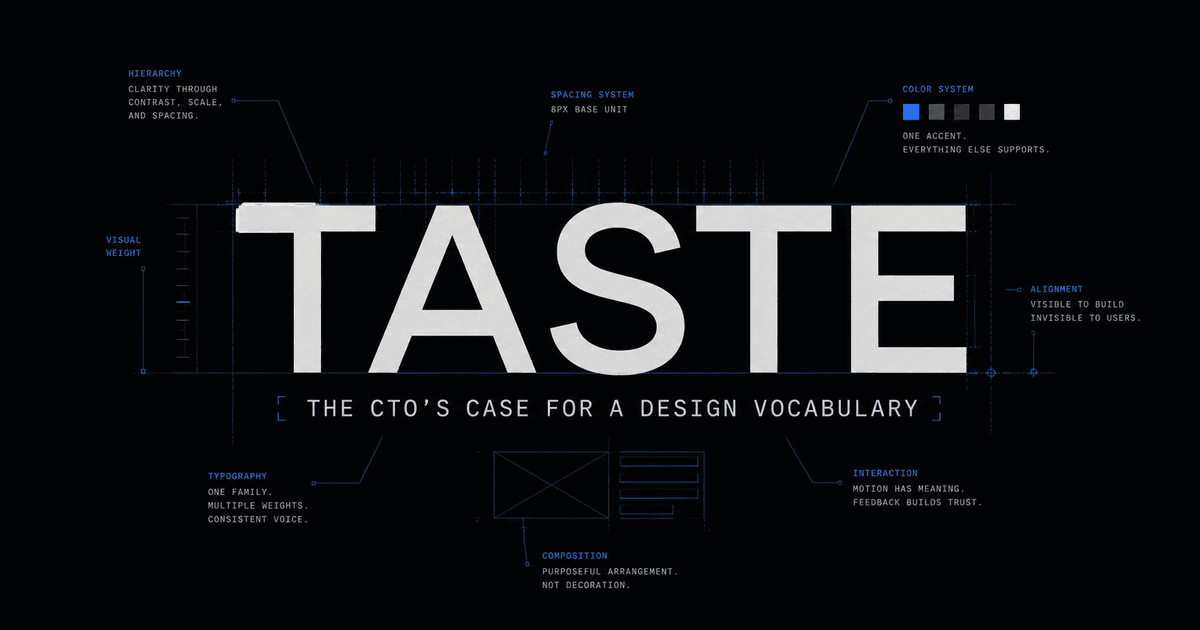
Taste Is Learnable: Three Questions That Unlock It
Taste is not a talent. It is a vocabulary. The gap is not between people who have it and people who do not - it is between those who have developed a framework for evaluating design decisions and those who have not.
A brand guideline is not a style sheet. It is a hierarchy of decisions about three things:
- What emotional state the company believes the user is in when they encounter the product
- What authority the company is claiming relative to that user
- What feeling the user should carry after each interaction
Color, type, and spacing are the instruments. These three questions are the score. Every time you look at a brand guideline - or build one - these are the questions you are actually answering.
Five concrete approaches to developing the vocabulary:
Study brand guidelines analytically. Nike assumes the user wants to feel capable. Apple assumes the user wants to feel that restraint signals mastery. Stripe assumes the developer user wants precision and zero friction. Linear assumes density signals engineering intelligence rather than clutter. Vercel assumes speed is an aesthetic in itself. Notion assumes the user needs calm to do focused work. For each one, answer the three questions above - not the colors, but what the colors are doing in service of those answers.
Understand color psychology with mechanism, not just association. Labrecque and Milne (2012) demonstrated in the Journal of the Academy of Marketing Science that blue triggers associations with trust (74% of participants) and competence (68%). Knowing the mechanism - not just that "blue feels trustworthy" but the perceptual basis for that association - means you can make novel decisions confidently rather than copying patterns you do not understand.
Study typography as tone of voice. A font choice is a claim. Tight letter-spacing on heavy-weight type signals confidence and precision. Generous body line-height signals that the product respects the reader's attention. A serif header in a B2B context signals permanence and authority. Monospace body copy signals technical authenticity. Every typographic choice is a sentence the product makes before a user reads the actual words.
Learn visual hierarchy as information architecture. The eye follows gravity: weight, contrast, position, and whitespace. The most important element on a page should have the most breathing room around it. The most important number on a dashboard should have the lowest visual noise surrounding it. When you can describe what the eye reads first, second, and third - and why - you can evaluate whether a layout is communicating in the right order.
Build a swipe file with annotations. Collect screenshots of interfaces that produce a strong response. The discipline is one sentence per capture: not "I like this" but "this works because the accent color appears exactly once per view, so every instance signals an available action." The annotation is where taste gets encoded into vocabulary you can use to direct others.
The Vocabulary of Visual Design
Three elements do most of the work in any interface. Understanding each as a deliberate choice - not a default - is where vocabulary starts.
Typography: weight as the primary hierarchy lever
The portfolio design system shown later in this article uses a single font family across all type sizes. The hierarchy signal comes entirely from weight: 700 weight with tight letter-spacing for headings, 400 weight with 1.6 line-height for body copy. No display fonts, no decorative mixing - one family, one lever, total control over emphasis.
700 weight / -0.03em tracking - heading
Platform reliability at scale
400 weight / 1.6 line-height - body
One font family. Two weights. The hierarchy signal comes entirely from weight variation - no size explosion, no decorative mixing. The constraint is the decision.
Spacing: breathing room as a priority signal
The amount of whitespace around an element signals its importance. Tight spacing says "this is detail." Open spacing says "pay attention here." The two cards below contain identical content - the only variable is padding.
Tight - signals detail
Revenue
£2.4M ARR
+18% MoM
Open - signals priority
Revenue
£2.4M ARR
+18% MoM
Motion: duration as weight
Fast transitions (150-200ms) signal responsiveness. Slow transitions (400ms or above) signal ceremony. Neither is wrong - but mixing them without intention produces an interface that feels incoherent. The portfolio system uses 0.2s ease for interactive state changes and 0.4s cubic-bezier(0.22, 1, 0.36, 1) for entrance animations. The CTO who says "the animation feels off" without being able to name why is guessing. The CTO who says "that hover transition is 600ms - it reads as ceremonial, not responsive" is directing.
Ten Palettes: A Plug-and-Play Toolkit
Color psychology is not arbitrary. Blue wavelengths are consistently associated with competence and trust across cultures - Labrecque and Milne (2012) found 74% of participants associated blue with trust and 68% with competence. Dark surfaces reduce ambient luminance contrast, narrowing attention toward on-screen content. This is why every serious data environment - Bloomberg Terminal, Grafana, every trading platform - defaults to dark. It is not fashion. It is attention engineering.
The ten palettes below apply this logic deliberately, each calibrated for a different audience state and product register. The mockup beneath each is rendered in live HTML and CSS - not a generated image - so you can see exactly how the palette behaves in a real interface context.
What "Technical Precision Meets Practiced Ease" Actually Means
That is the creative north star of the portfolio design system shown in palette one. Not a tagline - a brief. Every design decision is evaluated against those four words before it ships.
"Technical precision" means: nothing decorative, no wasted pixels, no gradients deployed for atmosphere, no animation that does not carry information. The accent color (#4A7FE0) appears on no more than 5-8% of any screen at rest. Every blue pixel is an interactive affordance - a button, a link, a focus ring. Nothing decorative gets it. The scarcity is the signal.
"Practiced ease" means: this does not look like effort. Generous spacing. Weight doing the hierarchy work without size inflation. Smooth state transitions that respond without performing. A single font family across all type sizes, with weight variation as the only lever.
The system holds a three-tier token structure: raw hex primitive values, semantic tokens (--accent, --surface-base, --border-default), and a theme layer that wires semantic tokens to the active palette. This is how taste becomes reproducible rather than held in memory. When a new component is built, it references --accent and --surface-raised, not #4A7FE0. The visual judgment was made once, encoded precisely, and inherited by everything built afterward.
Back to the credibility strip. The original layout - card grid, large gradient metric values, label beneath each one - was the default pattern. It is what any AI tool generates for "show your key achievements." The numbers were strong: 3x delivery velocity, 60% cloud cost reduction, a team built from one to fifteen.
The audit flagged it P1 because the pattern contradicts the position. Executive search recruiters see that grid layout on every SaaS marketing page. It reads as marketing energy, not operational clarity. The restrained presentation - smaller type, tabular layout, no gradient, muted label treatment - signals that the person who built it understands what executive credibility looks like. The data does not change. The frame changes everything.
Developing taste means knowing this before the audit flags it.
Encoding Taste So AI Inherits It
Taste held only in your head runs in exactly zero AI sessions. Taste encoded in a file runs in every session.
Without a design context block, this is what Claude generates for "create a metrics display section" - the same pattern that was flagged in the opening story:
<!-- No design context - Claude defaults to the statistical mean --><section style="background:#f8f9fa; padding:4rem 2rem; border-radius:16px;"> <h2 style="font-size:2.5rem; font-weight:800; background:linear-gradient(135deg,#667eea 0%,#764ba2 100%); -webkit-background-clip:text; -webkit-text-fill-color:transparent;"> Key Achievements </h2> <div style="display:grid; grid-template-columns:repeat(3,1fr); gap:1.5rem;"> <div style="background:white; padding:2rem; border-radius:12px; box-shadow:0 4px 24px rgba(0,0,0,0.08); text-align:center;"> <div style="font-size:3rem; font-weight:800; color:#667eea;">3x</div> <p style="color:#6b7280; margin-top:0.5rem;">Delivery Speed</p> </div> </div></section>With a 12-line design block in CLAUDE.md:
<!-- With CLAUDE.md: accent #4A7FE0, bg #202124, surface #303134 --><section style="background:#202124; padding:3rem 2rem; border-top:1px solid #303134;"> <p style="font-size:0.6875rem; font-weight:600; color:#9AA0A6; letter-spacing:0.08em; text-transform:uppercase; margin-bottom:1.5rem;"> Operational Record </p> <dl style="display:grid; grid-template-columns:repeat(2,1fr); gap:1.5rem;"> <div> <dt style="font-size:2rem; font-weight:700; color:#E8EAED; letter-spacing:-0.02em; line-height:1;">3x</dt> <dd style="color:#9AA0A6; font-size:0.8125rem; margin-top:0.375rem; margin-left:0;">Delivery velocity</dd> </div> </dl></section>The difference is not the model. The difference is whether the model has a standard to target.
The CLAUDE.md block that produces the second output:
## Design Standards
### Color palette- Background (page): #202124- Surface (cards, panels): #303134- Accent (interactive only): #4A7FE0 - max 8% screen coverage at rest- Text primary: #E8EAED- Text muted: #9AA0A6
### Typography- Single font family across all sizes- Headings: 700 weight, -0.03em letter-spacing- Body: 400 weight, 1.6 line-height- Labels: 600 weight, 0.06em letter-spacing, uppercase
### AestheticTechnical precision meets practiced ease.No decorative gradients. No gradient text. No card grids with large metric values.Every accent-color pixel is an interactive affordance. Nothing decorative gets it.
### Anti-patterns- No SaaS landing page cliches (gradient text, big-number card grids)- No rounded-xl on structural containers- No decorative animations- No multiple accent colors
Two skills extend this further. The /impeccable skill loads a PRODUCT.md and DESIGN.md context file, then applies a structured color strategy framework across four levels: Restrained (tinted neutrals plus one accent below 10% coverage), Committed (one saturated color carrying 30-60% of the surface), Full palette (three to four named roles used deliberately), and Drenched (the surface is the color). Each level is a deliberate position on the commitment axis.
The /ui-ux-pro-max skill applies 161 palettes, 57 font pairings, and 99 UX guidelines as a structured quality bar against every AI output. Both tools make the same point: when you give AI a standard rather than a prompt, you get output that can be evaluated against that standard rather than output you are guessing about.
The workflow:
- Define a creative north star - four to six words that answer the three questions (emotional state, authority claim, post-interaction feeling)
- Choose a palette and a typography approach from that answer
- Encode both in
CLAUDE.mdandDESIGN.md - Every AI session inherits your taste, not the statistical mean
The bottleneck is not the AI. The bottleneck is that you have not decided what good looks like. Until you do, you are not directing a tool. You are approving outputs at random.
Sources
- McKinsey & Company (2018). The Business Value of Design. mckinsey.com
- Labrecque, L.I. and Milne, G.R. (2012). "Exciting Red and Competent Blue: The Importance of Color in Marketing." Journal of the Academy of Marketing Science, 40, 711-727. springer.com
- Mathur, A. et al. (2025). "Interrogating Design Homogenization in Web Vibe Coding." arXiv. arxiv.org
Working through the challenges in this post? I help engineering leaders and CTOs navigate complex technical decisions and scale high-performing teams. Schedule a consultation →